What Wasn't Working
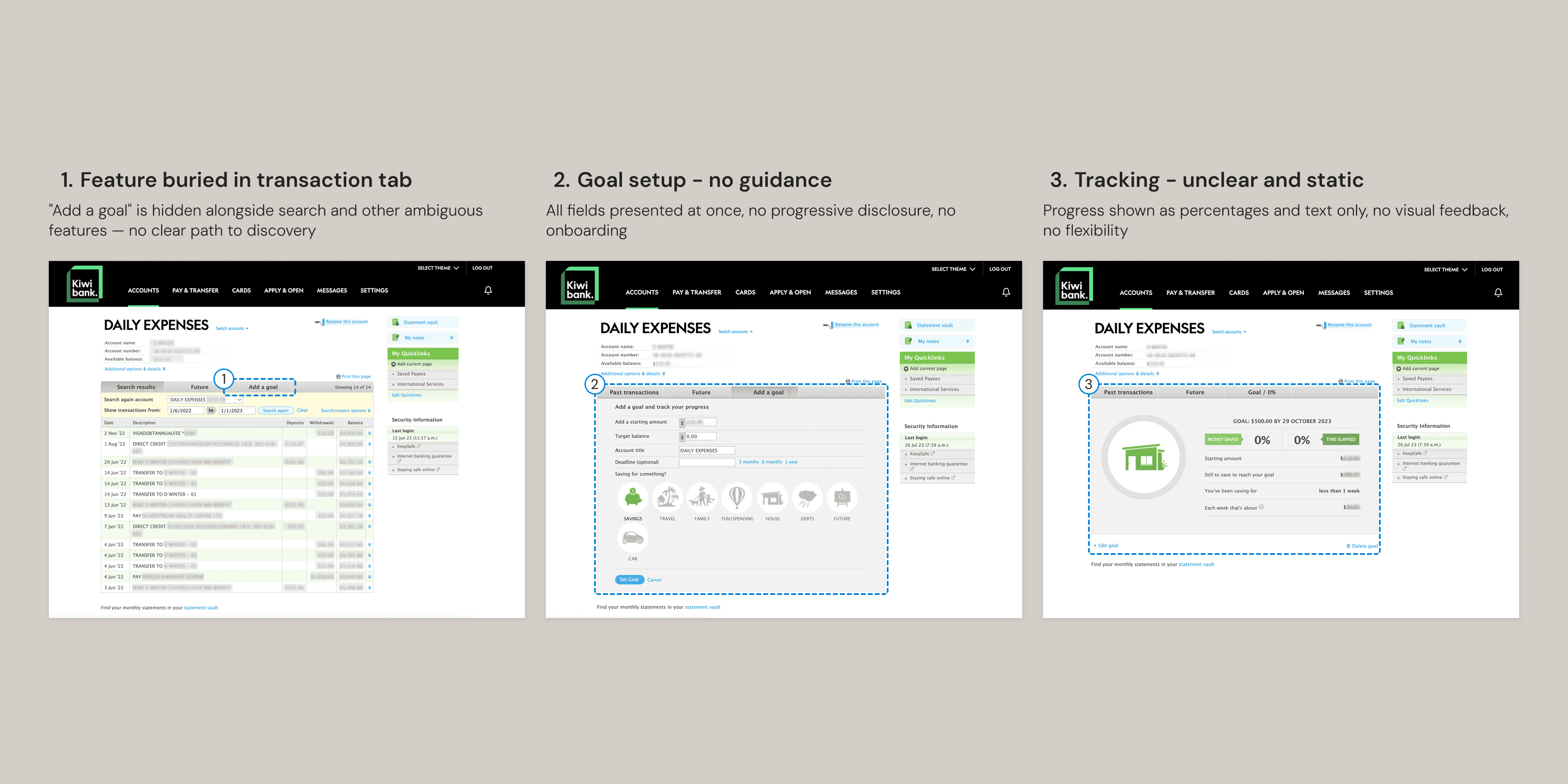
Three steps, three problems — the feature is buried in a transaction tab, setup has no progressive guidance, and tracking gives no meaningful visual feedback.
The Redesign
I wanted to give the savings feature more prominence in the interface. Moving it from behind a tab to a dedicated card at the same level as account information means it's immediately visible. A sidebar menu replaced the original top bar, creating a more dashboard-like layout where account information gets clear priority and navigation items sit closer at hand.
For data visualization, I started with progress bars and simple percentages, then tested showing multiple data points simultaneously. The information was all relevant — but presented at equal weight, nothing stood out. The final version carries the same richness but gives it a hierarchy. The weekly bar chart leads, with dollar amounts, percentages, and time remaining supporting at a smaller scale. You know where to look first.
Amount and deadline sit together because they're interdependent — together they generate the weekly target.
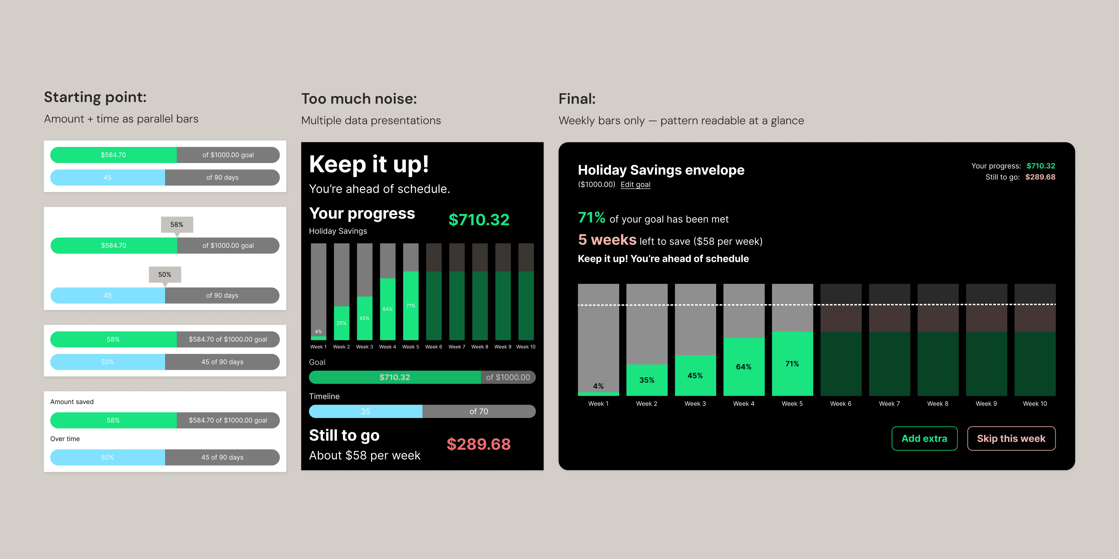
Starting point, too much noise, final — from parallel progress bars to a single weekly bar chart readable at a glance.
The color system extends Kiwibank's brand palette with a functional semantic layer. Green for progress and positive reinforcement. Cyan for available balance — the most important number on the screen. Coral for the remaining amount — warm but not alarming. Red for negative transactions. Grey for uncommitted future weeks — neutral, no pressure.
Goal setup is split into two steps. Amount, target, and deadline sit together in the first modal because they're interdependent — one affects the other, and together they generate the weekly calculation shown on the next screen. Contribution method is a separate kind of decision, so it gets its own step.
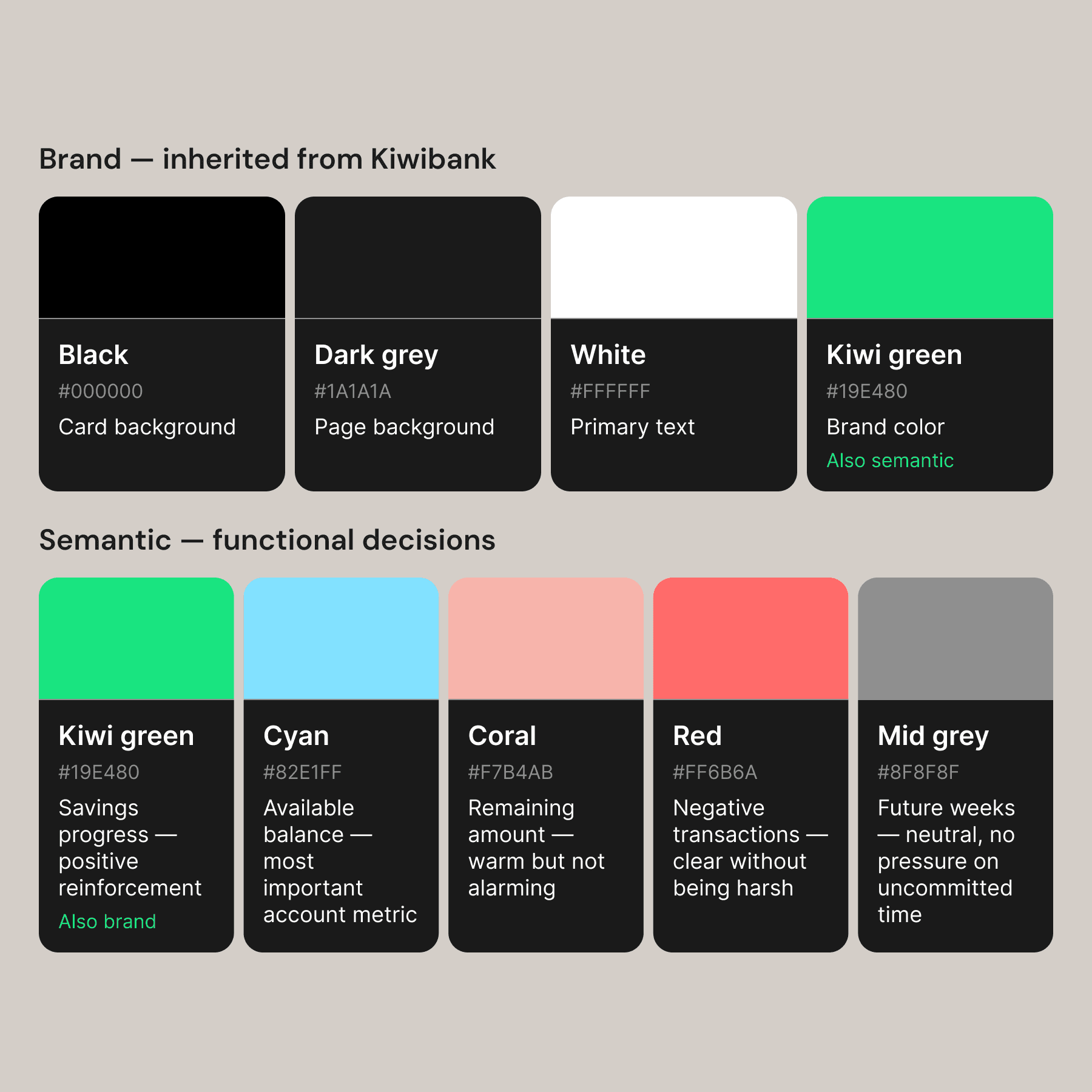
Brand palette inherited, then extended — each added color carries a specific meaning in the context of savings tracking
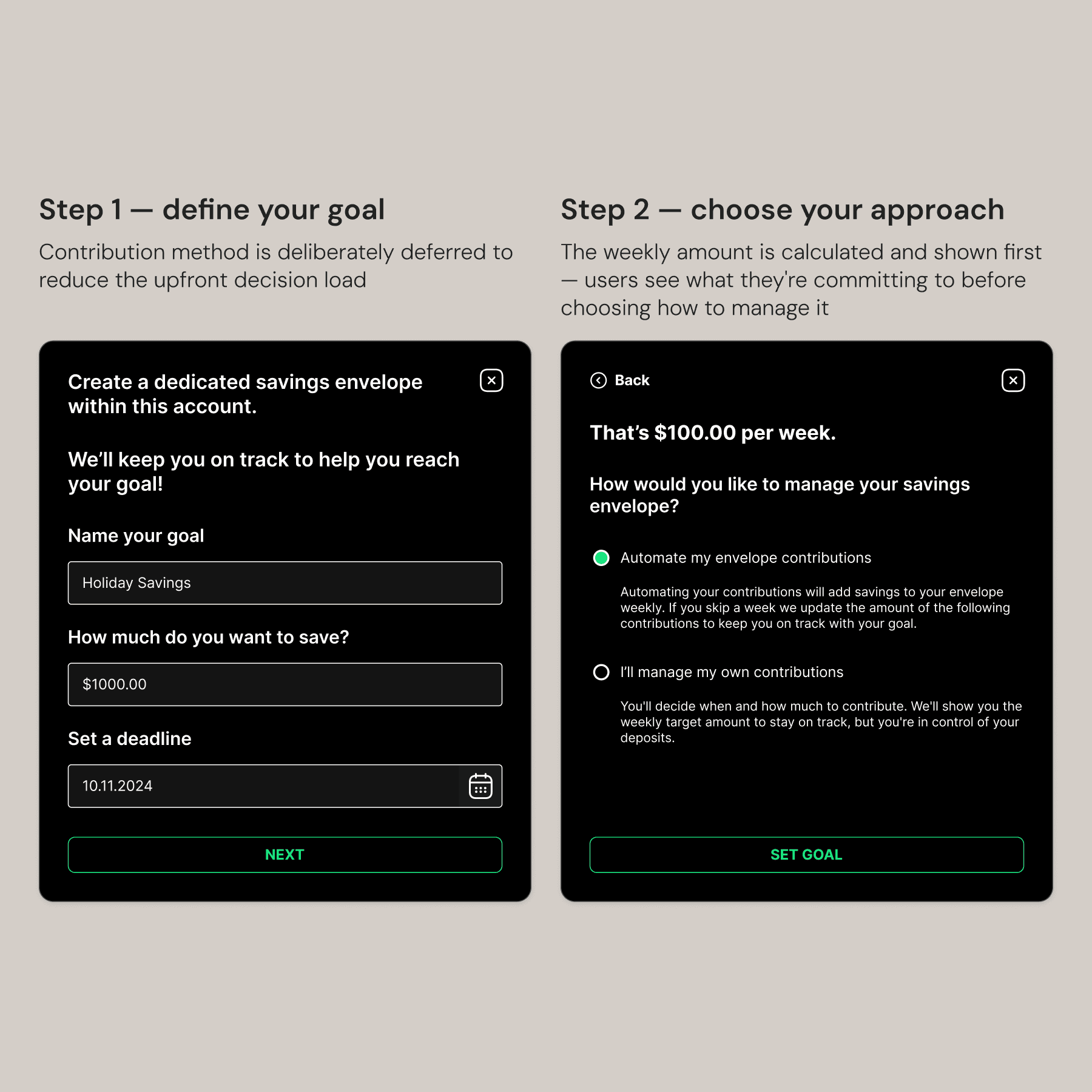
Step one defines the goal, step two chooses how to get there — the weekly amount is calculated and shown before users commit to an approach
Show people the number before asking them to commit to an approach.
The empty state uses a hover interaction to preview the experience — the card responds before you click, indicating what a set goal will look like. It's an affordance and an onboarding moment at the same time.
Hover previews the savings visualization before users commit — the empty state teaches the feature
Skipping a week triggers a recalculation — The weekly target updates so users can see exactly what they need to save from here.
The bar chart is the core of the feature. Each bar represents a week, and the number of bars is generated from the user's deadline. Progress is cumulative and readable at a glance. Skipping a week or adding extra triggers a recalculation — the weekly target updates so users can see exactly what they need to save from here to meet their goal. This works within a reasonable timeframe, though longer goals would need a different approach — which remains an open design problem.
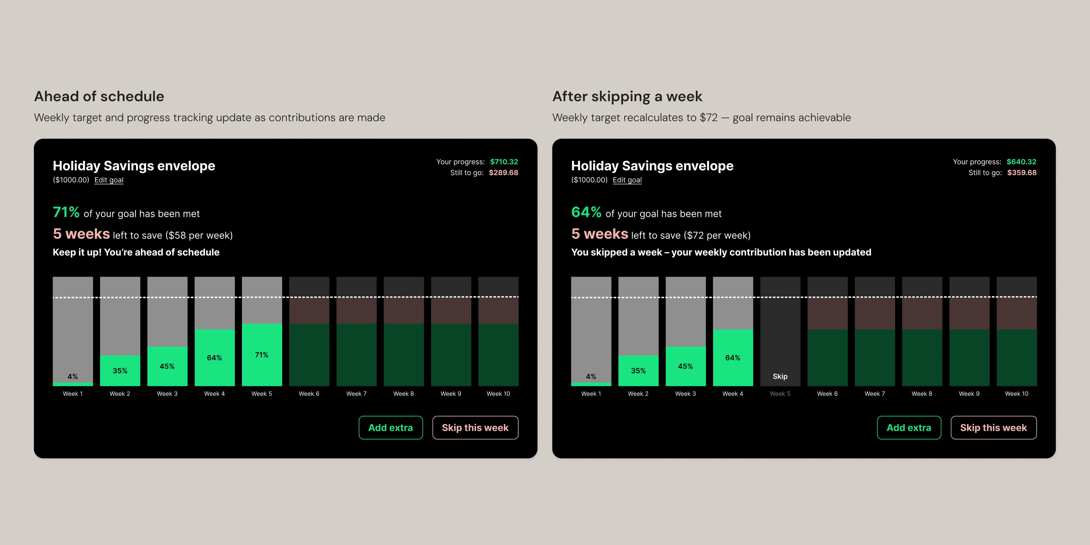
On track and after skipping a week — the weekly target recalculates from $58 to $72 showing users what's now needed to meet their goal.
Full interaction — from empty state through goal setup.
Next steps
To fully complete this project I'd want to design the edge cases properly— goal completion, failure, reset, dismiss, and the overdraft scenario. I'd also consider multiple savings envelopes, allowing users to save toward several goals at once.
I designed from my own experience as a Kiwibank customer. User testing would pressure-test my decisions and surface needs I haven't considered. Longer term, I'd want to understand how this feature connects to Kiwibank's broader product ecosystem — notifications, other account types, and financial planning tools that a savings goal would naturally touch.